


|
John's Blog
Friday, June 24 2016
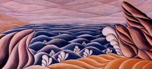
Seascape This print was made from an original oil painting, as were the other lithographs. It was printed in an edition of 1000. I painted this as a sort of tribute to the sea. I grew up near water and have sailed many times in a boat I once had. It is also more from my time on the Northern California coast. I had many good times drinking wine and eating cheese on small beaches below cliffs that abound on the coast north of San Francisco. Then there was the year I owned a sloop and sailed the USA east coast from New York to Florida but that is a story for another time. [grin] With the painting I wanted to create an almost uniform pattern to the waves that gives a sense of distance but also a sense of rhythm that I always see when watching waves hitting the shore. I used my "swirly" style to create an almost graphic look. The original was sold some time ago. The print is 9.25 x 20 inches with a white boarder for matting and framing signed and numbered by me. The price is $49.00 each shipped from my studio. To learn more about prints and/or to purchase a print please go to my Limited Edition Print page. If you have questions about this or other prints or paintings please contact me via this site or use the contact from my Contact Page.
Sunday, June 19 2016
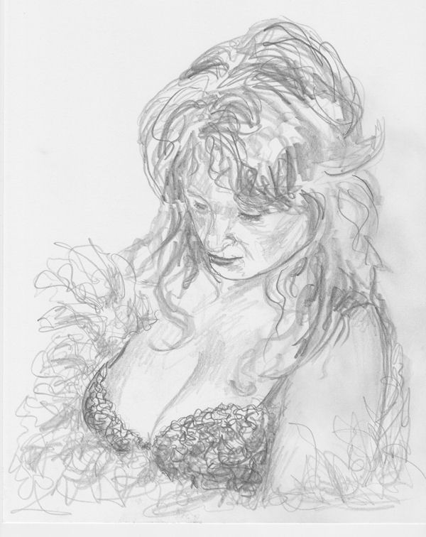
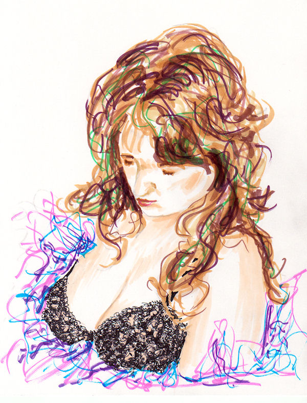
This is the first of a series of sketches and drawings of what I call my "Lady in Lace" This first one is about 10 x 8 inches and was done quickly. The second was done with felt tips and is the same size since the basic drawing was traced from the first sketch.
Below is a pastel version of the drawings, now it is done with pastel pencils. The original has been sold but I did post the image on Fine Art America for anyone interested in a print. [Click Here] to view the options 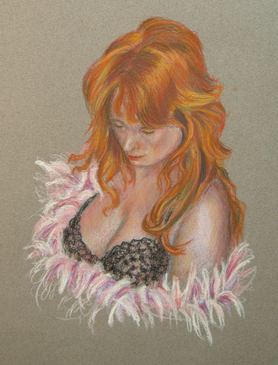 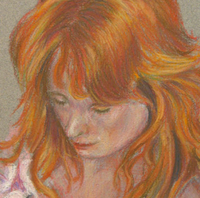 Monday, June 13 2016
I posted this blog right after I completed the painting, Michael Jackson as Blue Boy. However I have received so many comments and questions about it I've decided to repost it now. Hope you find it informative. I hope you will take the time to read below or at least skim over it and look at the progress drawings. Or you can go to the Completed Painting of Michael Jackson as Blue Boy. My painting of Michael Jackson as The Blue Boy was inspired by my fascination with the unending media attention given to Mr. Jackson's death. If you took the time to read the page with the larger image you would have seen the history of the original painting by Gainsborough as well as some of my thoughts about my version. If not I am repeating them here. Because the "The Blue Boy" is so famous, (At one point almost everyone's grandmother had a copy hanging on the wall. I know mine did.) I think it fitting to portray Michael Jackson as an updated version. Why? The boy originally was painted in very fancy dress not worn by his contemporaries. He was thought of as a "pretty" boy, and his image has become one of the best known by even those who know nothing of art. The painting and Michael have caused extensive media coverage and controversy..The painting and the man became larger than life with both always in the news. One other thought crossed my mind as I was painting. The controversy in 1922 was not about the young man in the painting but of the icon it had become. The newsworthiness of Jackson is now more about the controversial icon he was or is rather than the musical wonder he was at one time.
What I will attempt to do here is explain my painting process and some of the thoughts I ha 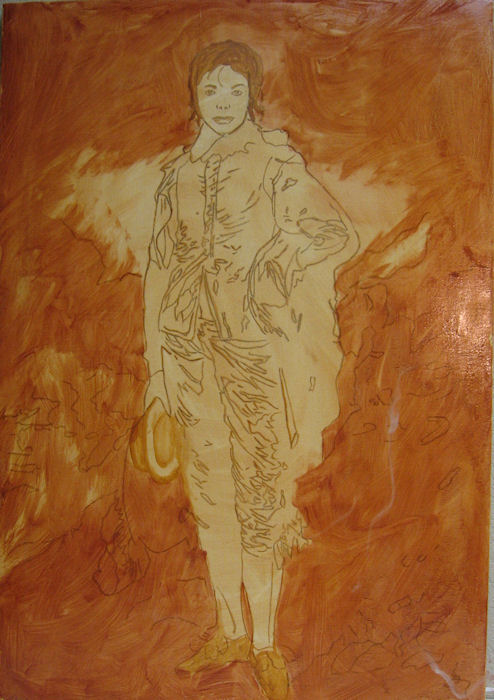 d as I worked. Much of this is in technical, painter terms. You may find it boring, but I'm asked by many of my followers, both painters and partons, to do this when I can. I'm told it gives a better and deeper understanding of my work. (Then there are those who say, "Just shut up and paint. Let the image do the talking.") d as I worked. Much of this is in technical, painter terms. You may find it boring, but I'm asked by many of my followers, both painters and partons, to do this when I can. I'm told it gives a better and deeper understanding of my work. (Then there are those who say, "Just shut up and paint. Let the image do the talking.")To begin I used the Internet to research as many photos as I could of Michael at various stages of life and in various clothing. I admit, I didn't know much about him when I started. I actually knew much more about the original painting then I did of Michael. I knew I wanted to add the face, glove, hat, shoes entrance to Neverland but wasn't sure exactly which face I wanted to put on it. At first I had decided to use one from what might have been is more productive time and where, I think, he was his most good looking. Finding photos of the original Blue Boy painting was, of course, very easy. Once I had all the reference material I did a number of sketches until I had the drawing, full size, 32 x 22 I wanted. I stretched a canvas of Belgian linen and prepared it for the initial toning of the ground. I toned this ground with raw sienna. I then traced the drawing on the canvas. The next step was to go over the tracing with darker raw sienna and block in the background with more of the same and some burnt sienna. 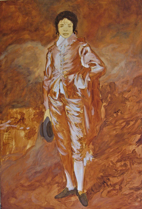 You can see here where I had chosen a much younger face than the one I ended up painting. These stages dry quickly so I can paint again the next day. The next stage was to add some highlights of a weak white and the shadows with a deeper burnt sienna. Here I also added some darks for the hat, shoes and hair. Once I have this much done I can sort of "see" what I want to do and how to proceed. Up to this point even if it might look as if I were very sure of what was going to happen I often find when I get here something very basic is very wrong. Not the right size canvas, wrong size image for that canvas, lighting balance or center of focus will never be right. Of course, in this case, I really didn't have to worry too much since all the real work was done for me by Mr. Gainsborough. 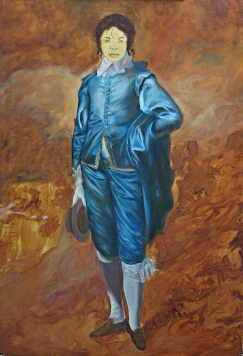 Next comes what I call the local color. Surprise! Blue. From the beginning I had intended to make my version more colorful than the original and use a brighter blue as well as more warm tones in the background. I wanted more color and chromatic contract than in the original. The original is rather muted but I admit I have never really seen the original in person so I'm not sure what it is for real. In any event I put in the blues using prussian blue, (one of my favorites). I also worked on the background here using combinations of prussian blue, burnt sienna and yellow ochre. I was still keeping things light and mostly just defining shapes and shadows. When this stage was dry and ready to proceed I started to worry about the face. I even went so far as to print various photos the exact size and cut them out and paste them on the painting. I change them over and over not quite sure what I wanted. I finally decided on the later face with the longer hair or wig. I felt it added more drama to the image with that sad, almost sterile face with so little expression. I also think it helped to show what I thought was so sad about all this. Here was a very talented man, capable of and did dominate the musical entertainment world for so long and was loved by so many but still all his life felt there was something wrong with his appearance, never feeling he was what he wished to be. 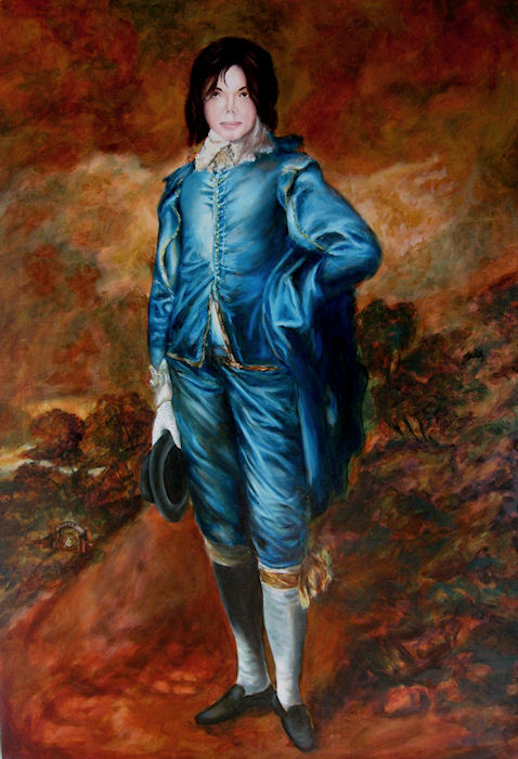 With the next stage I worked on bring up the background to a stage nearing completion. I added the little Neverland entrance brought down the colors of the sky and the land a great deal with the same colors as earlier and I added more depth to the clothing with more of the same colors and some Ultramarine added. The shoes hat and hair were deepened making a black from the blue and burnt sienna. Very little white was used. Only a bit in the sky and some weak versions for the highlights of the gown and socks. The most white was used in the creation of the sequined glove. With the next stage I worked on bring up the background to a stage nearing completion. I added the little Neverland entrance brought down the colors of the sky and the land a great deal with the same colors as earlier and I added more depth to the clothing with more of the same colors and some Ultramarine added. The shoes hat and hair were deepened making a black from the blue and burnt sienna. Very little white was used. Only a bit in the sky and some weak versions for the highlights of the gown and socks. The most white was used in the creation of the sequined glove.Once the face was roughed in using my traditional flesh colors, vermillion, yellow ochre and cerulean blue with white I added some of the details of the eyes with my made up black and a deep brown from the same colors. At this point and from here on out most of the work is very subtle using glazes. For those interested, many paintings are done with the colors applied thick enough so other colors don't show through them. This gives a painting a very strong and solid look. Other painters, such as myself, prefer to use what are called glazes. This is the application of very thin layers of transparent color over other colors to create a new color by way of the eyes interpretation of the optical effect. Many if not all of the old masters used this and some such as Leonardo used it almost exclusively. To see the final image please go to this page of Final Image of Michael Jackson. There you can also see details of the face and Neverland. Saturday, June 11 2016
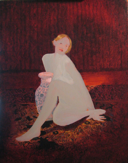
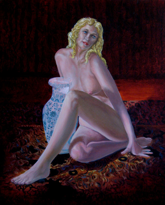
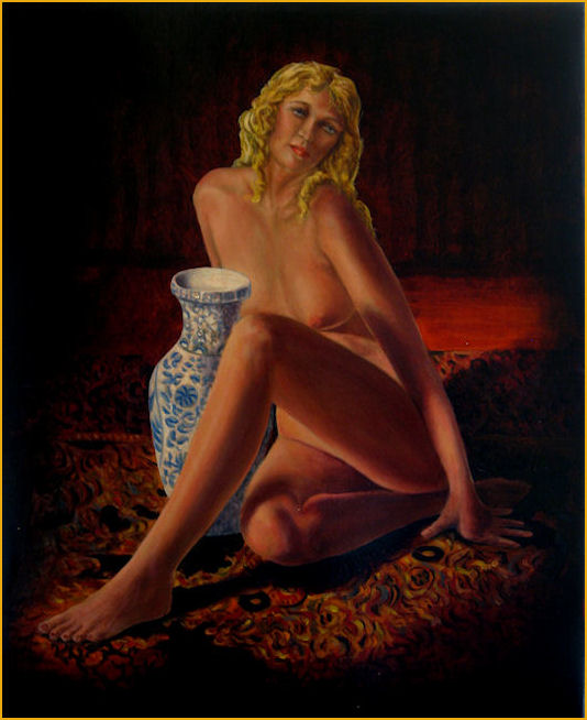
I have learned that many of my patrons, students and friends enjoy visiting the studio to see the works in progress so I have developed the habit of photographing most of my work in the various stages. The images and story below are an explaination of the process of painting, "Ursula" (Her real name is Heather, but that is a different story.) a nude done from a combination of photos taken of my model and working from life sketches of her. I seem to have lost the sketches but this first image is of the early stages of the painting. The original canvas was about 30 x 20 inches as seen in the image to the left. The image to the right was after I realized I had too much blank area and restretched it to 22 x 18 inches.
I don't have images of the very beginning stages of this painting but if you have seen some of my other posts you know how I start and proceed to get to this point. I usually paint the figure in very pale grays and whites just to establish the basic shadow pattern and facial expression. The background is brough up beyond the figure and in this case the jug, (the ceramic one) is also kept as a pale underpainting. I like the detail in the orienta rug and in the vase in contrast to the simplicity, softness and smooth flow of the woman's skin. Warm soft rug, hard cold vase and soft cream like skin of a woman.
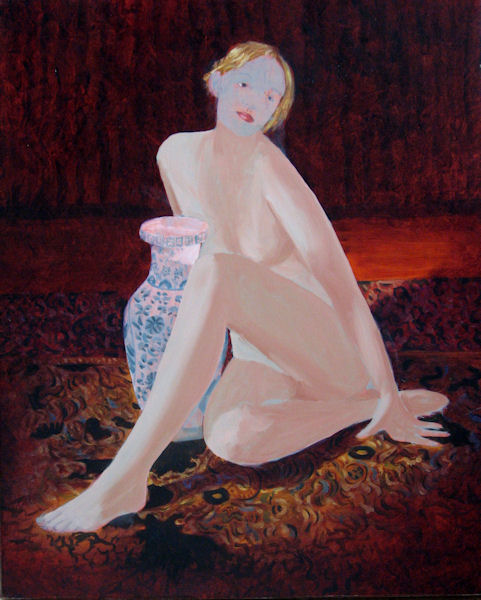
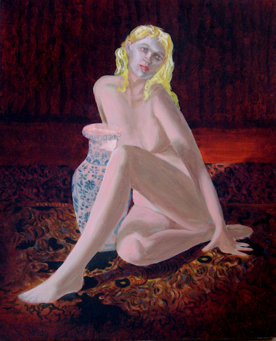
In the next phase (image to the left) you can see I decided to change the hair and make it longer and flow over her shouders. At this point I also brought the skin up some and worked the background into deeper colors and more details. This is true of the vase to some small extent. With the image on the right above you will see the skin is again much more defined but still cool colors of blue and green grays. The expression on the face is more complete as is the hair and the background is almost as dark as it ever needs to be. From here on it is painted almost exclusively with glazes. (thin layers of transparent oil paint) This gives it a deeper and richer look in the shadows and allows me to create colors by overlaying one transparent layer over another to give a final effect that can not be achieved with opaque paint. The final painting below is 22 x 18 inches. Not much more to say. I hope the final painting will speak for itself. Purchase information about this painting can be seen at: "Ursula"
Monday, June 06 2016
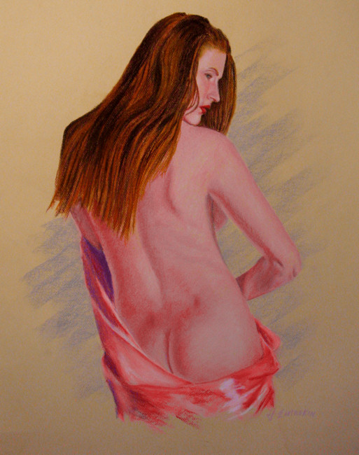
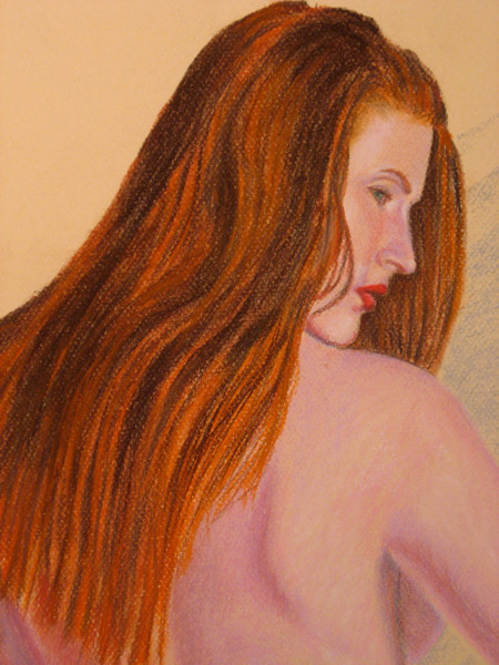
This is a pastel measuring, 24 x 18 inches. "Pastel Nude In Pink Drape."
This was done from a combination of photos of this model and her posing for me as I worked after about half way done. This is a very common way for me to work on pastels or oils. I had only done one painting of this lovely girl when I did this one. I knew I was going to do a number of paintings of her but with the first one I struggled with her fair skin tones. It was important to be correct with that wonderful red hair. That was what drove me to do this piece. I think from it I was able to learn enough to go forward with the other paintings. I often do pastels of models to learn more about the colors needed to properly get the skin tones. I also enjoy doing them because they go faster than the oils. This one was done almost exclusivly with pastel pencils and is on toned paper. Many times clients request pastel portraits instead of oils, not just because they are less expensive, but because they have a certain drawn quality to them many prefer. I also added a closeup of the head just to show the technique and color a little better. I can't say for sure but I think I only used about a dozen colors for the whole thing and that is very rare for me. If you would like to see a larger image please go to, Pastel Nude in Pink Drape.
Sunday, June 05 2016
Most paintings of mine have a story and some are more interesting than other. They all seem to have something to do with my past and my present. What I felt then and what I feel now. A few years ago I went through a very devastating breakup. I was the one devastated, not her. It sent me into a very depressed period, which, I'm happy, note; very happy to say is far behind me. Now being much wiser and with a very thick skin I can paint from a good place but for a while everything I did was dark and wrapped in sadness and loneliness.
All this thinking made me go back over my life and look at all the mistakes and how I got to where I was. Where I was, was very alone and on top of that almost broke. I hadn't shown work or sold to anyone but my old patrons in some time. To be honest, I really don't know how I got though those few months or much of what took place. During the ruminating over my past I went back over how I became a painter and when did I start doing working to be a painter. Although I had always been a child that drew constantly it wasn't a career. I went to a small community college more because my mother insisted than any other reason. Since I had always drawn she got me into a program of art and advertising. The art classes there were not much more or even as good as most that are in any high school now. I graduated and went to work for the New York Library System, as an illustrator, but was really not much more than a printing press operator. I was living at home and had a large bedroom with a sort of studio/office in it. I was there one weekend night, alone in the house. I found some old paints of my mother's that were mostly dried up and an old canvas board about 16 x 20 inches. I had an easel I brought back from college so I decided I should paint something to show I was really an artist. My parents always billed me as this trained painter now with a job in the art industry. Wow, what a stretch. I remember going through the tubes of paint and finding there were only two tubes, burnt umber and yellow ochre still soft enough to use. The only medium I had was turpentine. I set up the canvas on the easel and stood back to think of what to paint. Remember, this was the 60's. The art world was allover the place, but, it always is. At that age, I was 20; I decided to be an artist I had to be tragic. Well, I was, sort of. I wasn't in school any more; I was living at home and working in a boring job making very little money. I was stick in my hometown where the social life was limited to bowling or going to country music bars. Neither of which were something I could bring myself to do. I had no one in my life to really think about and knew I had to get out but didn't know how. I guess I was tragic after all. I just started painting. What I did was this dark tree on the left with one branch. Below the branch was a big hole in the ground. Standing over this was a figure looking into this hole with complete despair. This was all done in just the deep yellow and the dark brown. All sort of abstract and no very good. No, really bad. That was my evening and I never did go back to it. It sat on that easel for a very long time and then next thing I knew I was being drafted into the military. Well, things did change.
I put up a stretched canvas and went to work using my swirly style of painting. I wanted the same basic composition but with a bit more skill and color. What you see here is the result of one long night of painting. I thought of it as nothing more than a release and a sort of tribute to my start as a painter. A week or so later I had my grandsons over for the night. They always liked to see what I had been painting and always had an opinion. My youngest, Evan, sometimes asked why I painted so many naked women. He thought it was disrespectful. Yes, he was only 5! It did make me think. My older, Michael, was the deep thinker both then and now. He is a very sensitive young man. He stood and stared at my new painting and asked me what the name of it was. They always liked to name the paintings. I told him I didn't have a name yet. He took a few more moments and then said, "I think you should name it Strayed Path." Why, I asked. He replied it looked as if the person in the painting had lost his way and didn't know where to go. From the mouth's of babes. It did make me think and I was amazed he could see that much in there. I don't know if that is a tribute to my painting skills or just darn lucky with a very observant young man. I think the latter is more likely. The painting is still around and when I look at it now, I don't think so much of my depression at that time or the woman that caused it. I don't even think much of the reason or the origin. I really only think of my grandson and somehow he is connected to me now and is a part of who I was way back when I was 20 sitting in my room alone and wondering what to do with my life than. Still wondering about that but I like to think I have learned a great deal of life. You can see the painting, Strayed Path here, and Alone with Thoughts here. I'm still painting, and most of them are of beautiful women. Now days always with a high heart and healthy excitement. My grandsons are older now, and seem to accept me as the painter of beauty as I see it. Saturday, June 04 2016
This is another painting I started some time ago but was never quite right. It is an oil on canvas, 16 x 20 inches. Recently I went back to work on it to give it more color depth and a stronger sense of my swirls. What I am trying to do here is create a sense of nature but avoid realism to, I hope, make the experience as well as the appreciation of nature more intimate. The trees in the forground are evergreens but with colors beyond what nature might have chosen. The trees in the distanct center are very much unnatural yet here I am trying to draw the viewer into the patterning of the overall composition more the depict anything one might see while wandering in the woods. The objects in the forground to the right are nothing like I have ever seen in nature but I think might give the idea of flowers or tall grasses that are fun to observe.
I can still see her in my head when I look at it but do think it is better without her there. More my muse just imagined by me. To view a larger version and pricing information, [click here] |
 One of my paintings that has generated a great deal of conversation is named "Strayed Path"
 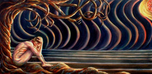 One of the paintings I did during this period was "Alone with Thoughts". The first title for this was "The Heart of a Blonde" but that seemed a little too pointed and negative toward women, which I have never felt. I sat and looked at it for days after it was done and tried to think of what to do next and where was I in my life. I felt it was one of the best things I have done if I were to base my critique on any painting that truly expressed my feelings at one given time.
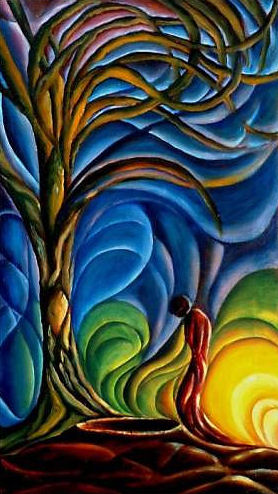 So, here I was sitting in front of another easel, nearly 40 years later and feeling worse than I had ever felt. The only difference was I had a lifetime of experiences and I was a better painter.
 Here is maybe the most interesting part. I was stuck with the whole thing at one point. I couldn't see it in my head, and had no idea how to porceed. A good friend of mine reminded me that my work has always seemed to center around beautiful women. She suggested I paint a young lady coming out from behind one of the foreground trees to give the whole composition more meaning to me. I tried it, and almost instantly I could see where to go. I finished the whole painting but then saw that the woman just didn't fit. So, I painted her out. [grin]